The Power of Data Visualization: How Esri’s Mapping Tools Make Complex Data Accessible
In today’s world, data is everywhere. From businesses to government agencies, organizations collect vast amounts of data daily, but the challenge lies in transforming this information into actionable insights. The key to unlocking the potential of this data is effective data visualization. Esri, a leader in Geographic Information Systems (GIS), offers a suite of powerful mapping tools that help businesses and governments make data-driven decisions by transforming complex data sets into interactive, easy-to-understand maps and visuals.
Transforming Raw Data into Actionable Insights
Data on its own can be overwhelming. Raw numbers and statistics can seem like an endless stream of information, making it difficult for decision-makers to identify trends, patterns, or critical insights. This is where Esri’s mapping tools come in. By leveraging GIS technology, Esri’s solutions can turn complex data into intuitive visual representations that reveal hidden patterns and trends, making it easier to analyze, understand, and act upon.
Esri’s Mapping Tools: Turning Complexity into Simplicity
Esri’s suite of mapping tools, such as ArcGIS, empowers organizations to visualize data in a way that’s accessible to a broad audience, regardless of their technical expertise. With Esri’s technology, users can:
- Create Interactive Maps: Unlike static graphs or spreadsheets, interactive maps allow users to explore data dynamically. They can zoom in, filter, and click through data points, providing a more engaging and immersive experience that leads to deeper understanding.
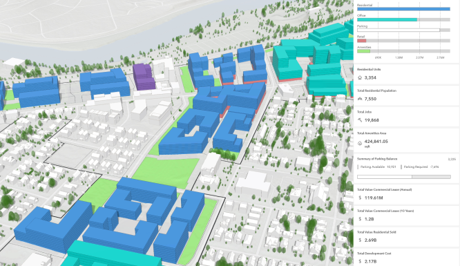
- Visualize Geographic Trends: Esri’s GIS capabilities allow businesses and governments to see how data is distributed geographically. This can reveal regional trends, identify areas of opportunity or concern, and help with decision-making related to resource allocation, urban planning, and service delivery.
- Integrate Multiple Data Sources: With Esri’s tools, organizations can combine data from multiple sources, whether it’s demographic data, environmental data, or economic data, into a single map. This integration gives a comprehensive view that can inform decisions across different sectors, from infrastructure planning to public health responses.
- Analyze and Predict Outcomes: Esri’s tools not only visualize existing data but also enable powerful analytics that can forecast future trends. By using spatial analysis, businesses and governments can predict patterns in everything from traffic flow to climate change, helping them proactively plan for the future.
The Impact on Business and Government Decision-Making
For businesses, Esri’s mapping tools provide valuable insights that can drive competitive advantage. By visualizing customer data, companies can better understand market segments, optimize supply chains, and improve customer engagement. For example, a retailer can use location-based analytics to determine the best locations for new stores based on customer demographics and traffic patterns.
Governments, on the other hand, can use Esri’s tools to enhance public services and address community challenges. By visualizing data related to infrastructure, public health, and social services, government agencies can make informed decisions that improve quality of life for citizens. During emergencies, such as natural disasters or pandemics, real-time data visualizations can help with resource distribution, evacuation planning, and response coordination.
Bridging the Gap Between Data and Decision-Makers
One of the most powerful aspects of Esri’s mapping tools is their ability to bridge the gap between data scientists, analysts, and decision-makers. While technical teams may understand the intricacies of raw data, non-technical stakeholders may find it challenging to interpret this information. Esri’s user-friendly mapping tools make it easy for anyone to engage with complex data, enabling more informed decision-making across all levels of an organization.
Moreover, Esri’s tools facilitate collaboration. With interactive maps and visuals, teams can easily share insights and collaborate on data-driven strategies, fostering a more data-centric culture within organizations.
The Future of Data Visualization
As data continues to grow in complexity, the importance of data visualization will only increase. Esri’s cutting-edge mapping technology is constantly evolving to meet these demands, integrating AI, machine learning, and real-time data feeds to provide even more powerful insights. Whether it’s visualizing the impact of climate change, optimizing transportation routes, or managing resources during a crisis, Esri’s mapping tools will remain at the forefront of transforming data into actionable knowledge.
Conclusion
In a world where data drives decisions, Esri’s mapping tools offer an invaluable resource for transforming complex information into clear, accessible visuals. By making data easier to understand and interact with, Esri empowers businesses and governments to make more informed, strategic decisions that can improve efficiency, drive growth, and enhance the quality of life for communities. The power of data visualization lies in its ability to turn complexity into simplicity, and with Esri, that power is in your hands.
About IMS Consulting:
For over a decade, IMS Consulting has been at the forefront of delivering comprehensive services across multiple platforms, including Archibus, ServiceNow, and ESRI, to our diverse clientele in both public and private sectors. As a dedicated small business, we offer personalized attention from experienced and certified consultants. Our experts collaborate closely with clients to deeply understand their operational processes, identify unique requirements, and uncover opportunities for enhanced management of their infrastructure. We are committed to helping you make informed capital budgeting decisions that yield benefits today and sustainably into the future.